R+D

At this stage focusing my project on children and creating it to be educative and informative still remains the same but however, I have now finally decided to create a project that is more and can be generalise to a wider audience.

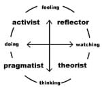
The title of my project will be called Learn4. the reason I pick that title is because firstly, it’s about learning and there are four basic learning theories from Honey and Mumford;

Activist: These are individuals thats just go along with everything and anything straight away.

activist

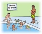
Reflectors: are individuals that like to participate in events but will like to ensure their safety and comfortability first. so they stand back and observe the situation before getting involved.

picture5


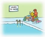
Theorist: are individuals that enjoy analysing and understanding why different aspect of elements or activities work the way they do.

theorist

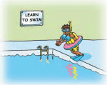
Pragmatists: are individuals that intend to find out how things function/work by physically doing it.

pci2


Read more at: http://www.open.edu/openlearnworks/pluginfile.php/69355/mod_page/content/1/learning_styles.pdf

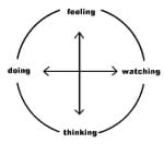
I also looked at Kolb’s experimental learning circle where he explained the process of how an individual learns and as I research more into his work, I discovered an updated version of his which was published in 2006 where it was argued that individuals tends to learn automatically using two different methods “doing and watching” “feeling and thinking”.

kolbstyles1 kolbstyles2

Read more at:

http://www.businessballs.com/kolblearningstyles.htm
 

R & D

This week I decided to focus my direction towards kids who might feel neglected due to their parents/guidance or sibling suffering from a specific mental illness.

The idea towards this project would be to educate children who might be feeling emotionally neglected to understand that their careers are suffering from an illness. The project would be an animated video series that would run week by week explaining the different types of mental illness, identifying and pointing out key behaviours that is common in a mentally ill patients. It would be created to be funny but informative at the same time to the targeted audience.

Mental Health.                                                                                                Children

What is mental health

Age  8 – 12yrs


Week by week discuss the different types of mental health (Animated series)

Interactive and educative for primary targeted audience.

  Technologies

-Ipads

-mobiles

-Laptops

-TV

Create a website where the videos can be uploaded to.

Method of distribution/broadcasting

Internet – YouTube

TV – CBBC

school


Anxiety and panic attacks

Bipolar disorder

Body dysmorphic disorder

Borderline personality disorder

Depression

Dissociative disorder


Semester 2 (R &D digital media concept)

We have been told to Research and develop an idea based on anything we want. In order words think of a problem and come up with a solution to that particular problem and it could be anything, we have been given the freedom to go wild and explore.

I went away and started coming up with different ideas/problems I feel I can find a digital solution to and below are some of the ideas I came up with:

Benefits

How do people on benefits (e.g. Income support) not stay on it for long. is there anything the government can trigger to make them move on and achieve something good with their lives.

OR

What can they do themselves to get a live they deserve and not be on benefits for a very long time.

Poverty alleviating in foreign countries.  Create a digital display that can be sent out to different countries suggesting and proposing ways that people can live better then they already are and how they can make use of there surrounding resources.
Encouraging people from different countries to visit the UK. 

Less and less people are visiting the UK and it is affecting the growth of the country. What is it about the UK that would be of interest as well as beneficial to foreigners.

Create a digital display that would be used to solve this problem.

Health (Fitness)

How to stay on top of your game.

Individuals who go to gym but end up not seeing any difference in their health and lifestyle.

√ what exercise is relevant to you.

√ Exercise used for recovery.

√ what do you when you got to the gym

√ do you need a personal trainer and Is there a need to join a gym?

√ Can you workout using your environment and save your money.

Creative

Creative students who graduate and end up not getting a job in the field they specialise in due to no availabilities of jobs, opportunities or even funds.

How would society/government/individuals tackle this situation and ensure that graduates secure a job straight after they graduate.

GCSE students.

A level students.

This were all my initial ideas I came up with but then I continued searching and doing research to see what I personally feel or think would be more relevant in our contemporary society.

Digital Media Convergence Task

PDF and video link below.

One minute me

The aim for my video was to see if I could make something out of nothing. I intended not to plan my shots but instead went out and got random footages and challenged myself to see what I could make out of them. I kept it simple with just texts in white and green colours and I think that worked well considering the fact that the footages were not just about one particular area but I caught different aspect of my surroundings such as Transportation, Education and Business.

I really enjoyed the deal of displaying images on top of a surface and I have accomplished this in my video by displaying texts to stick in front of a large building

As well as using texts I decided to create some moving shapes on a different building to see the kind of reaction I would get and how that would be different from just having still images or texts on a background.

The outcome for this was really brilliant, nothing but just coloured shapes in different sizes moving around bringing life to the building. It could be argued that with these different colours it gives a rough idea on how the building would look if it were to be red, blue or one of the other colours and that is a really good idea that could be useful for people buying or renting new homes and looking to change the colours of their paints.

My video could have been better if it was longer and I had more animations and tracking in it and it would have been more useful if it falls under a category rather than it just being random. The music piece used in the video really suits the style I was going for because it lifted and created a sense of balance between the footages and the animations. All credits to “Music by Dazed by airtone (c) 2012 Licensed under a Creative Commons Attribution Noncommercial (3.0) license. ccmixter.org/files/airtone/39444”

Logo

I made some useful research and studied how contemporary logos are now being made and got inspiration from a few companies such as PlayStation, Facebook etc.

All these logos meet contemporary designs and are easily recognisable. I have followed this movement in creating my own personal logo; I have gone for the colour green because one of the many things the colour is associated with is nature and I’m a big fan of my environment. I used my initials JU and my chosen font because it’s plain and simple, which is basically the idea for the logo ‘plain and simple’ also I included an image of a camera so it gives people the idea of the logo being media related.

Video link

https://vimeo.com/147797902 https://youtu.be/WU7_wdwWtJ8

Vimeo.com YouTube.com

Branding

This week in Digital Media our tutor acted as a potential client and requested us to create a brand for his new business. Our client is opening a new company that specialises in animal behaviour most especially dogs, he is looking to have branding appear on business documents and marketing. His company is new so the design should meet the standard of contemporary trends. He doesn’t want it to be location based as he aim to expand and become a national company, it should be professional and fun if necessary and also there should be an engagement between the pets and their owners as his company is interested in not just the animals but also the animal owners.

In my little group we decided to do some research and each came up with different ideas on how to approach the task.


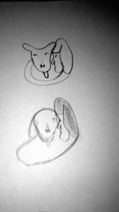
IMG_3047 I came up with this drawing and although it might not seem like it, the drawing shows a little puppy being wrapped around its owner. I came up with the design because just as the client requested, there need to be some sort of engagement between the dog and its owner so it would make more sense to have the design like that, also it very simple and has a meaning to it. If digitally drawn it would fit perfectly well under the category of contemporary design.

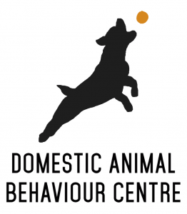
sam'sA dog jumping to catch a ball is an idea by a group member and I must say it such a brilliant idea. The dog jumping can be a symbol of freedom, and the ball could represent the interaction between dog and the owner. it’s simple, straight forward and meets the needs of a good brand.
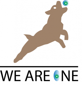
We are one logo

This is just me making few changes and giving the company a name I think suits it.