The Google logo to my opinion is an example of a really good logo, it’s professional in a sense that it is neatly written, readable, and goes straight to the point. At the same time it’s fun as you can see it plays around with different colours and it’s brighter, it could also be argue that the font is too simple and very childish. Please share your thoughts.
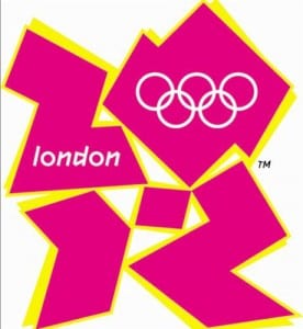
The London 2012 logo could possibly be argued to be an example of a bad logo. There is too much information going on in the logo but at the same time it doesn’t deliver a message as to what it actually is for. Without having any knowledge of what the logo represents and looking at it for the first time, you would have no idea it says 2012. Lastly we could also argue that the use of pink creates a very feminine meaning to it.
If we take a step back and look at the current trending formats for logos we would notice that simplicity is the main idea behind all branding in terms of details, gradients, shapes, font etc. we could ask why is that the case now? well It has can be argue that it makes the brands easier to recognise and if it works well on a big screen, it should also be perfect on smaller devices such as mobile phones, iPads etc. Using the Apple logo as an example, the logo has been designed that it is recognisable worldwide without even putting the word apple next to it.
Thank you.


